Yarn & handfeel
The first design decision is how the sock feels against the skin.
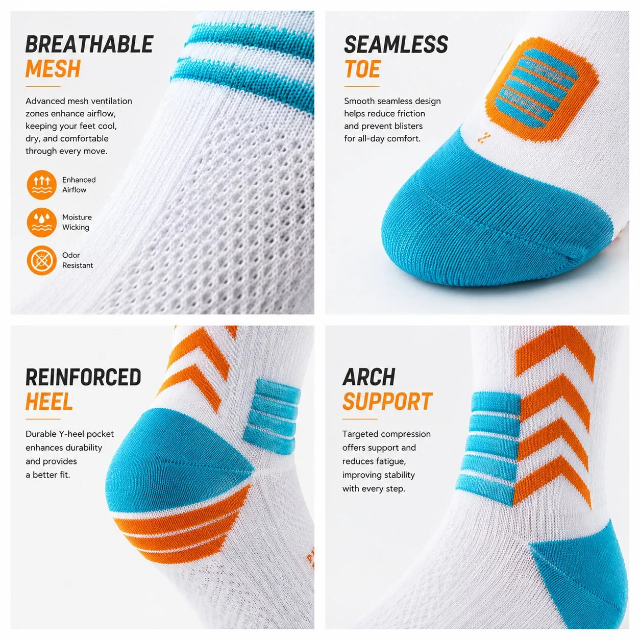
Cotton-rich softness, stretch recovery, and breathable knit zones work together so the sock feels familiar, stable, and suitable for repeated daily wear.
Brand & sock design
ARCDOVION design starts with the sock itself: yarn touch, cuff pressure, heel shape, cushioning, breathability, color, and the brand details that make every pair feel intentional.


Design philosophy
For ARCDOVION, design is not a decorative layer added after production. It is the way comfort, structure, movement, and identity are planned together from the beginning.
The page focuses on what shapes the brand and product: material choices, fit logic, cushioning zones, category colors, logo placement, packaging rhythm, and the calm athletic feeling behind the name.
Sock design system
Cotton-rich softness, stretch recovery, and breathable knit zones work together so the sock feels familiar, stable, and suitable for repeated daily wear.

Yarn & handfeel
Cotton-rich softness, stretch recovery, and breathable knit zones work together so the sock feels familiar, stable, and suitable for repeated daily wear.
Principles
Softness matters, but stable stretch, smooth seams, and breathable structure are what make comfort last through the day.
Different shoes need different sock heights and thickness. The product line is organized around real footwear and real routines.
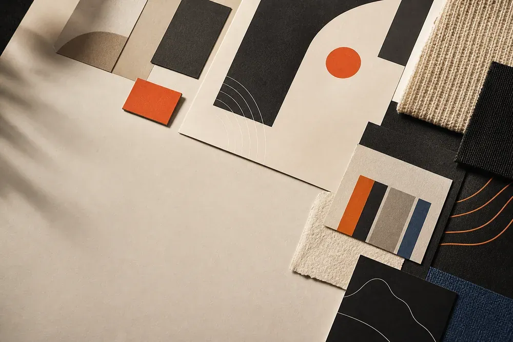
Neutral colors create daily versatility. Orange, blue, and green accents help signal motion, sport, and wellness without making the brand noisy.
Logos, labels, and packaging should clarify the product, not distract from it. Recognition grows from repeated, useful details.
Color & identity
Design culture
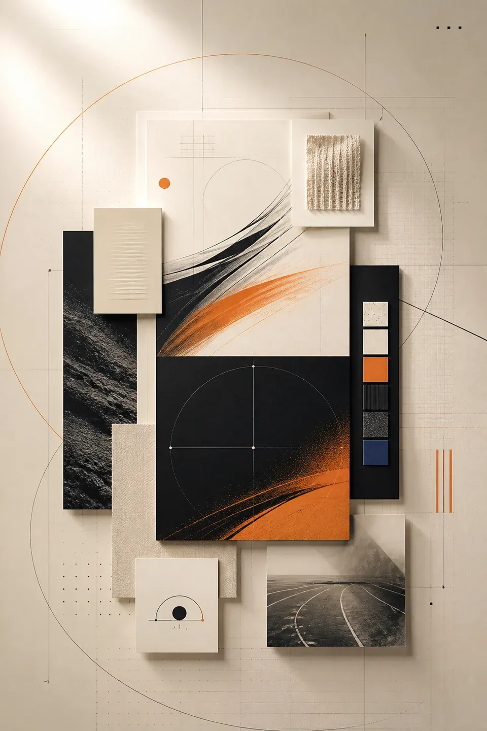
These boards connect the real sock category with ARCDOVION's brand language: knit texture, product structure, packaging marks, and athletic lifestyle expression.

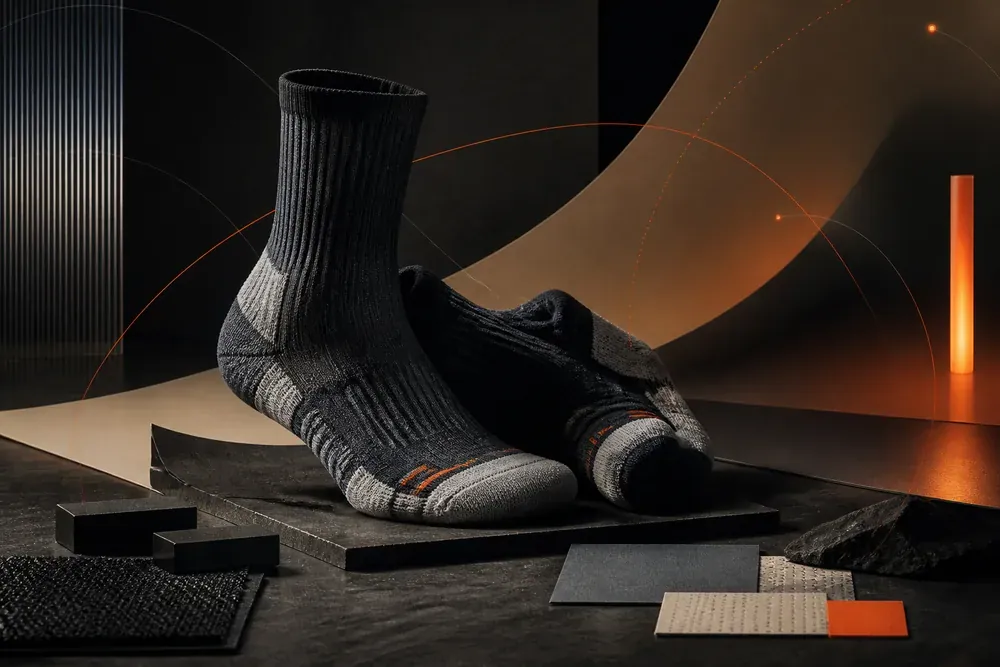
Close sock texture, warm light, and controlled contrast make the product feel premium without over-explaining it.

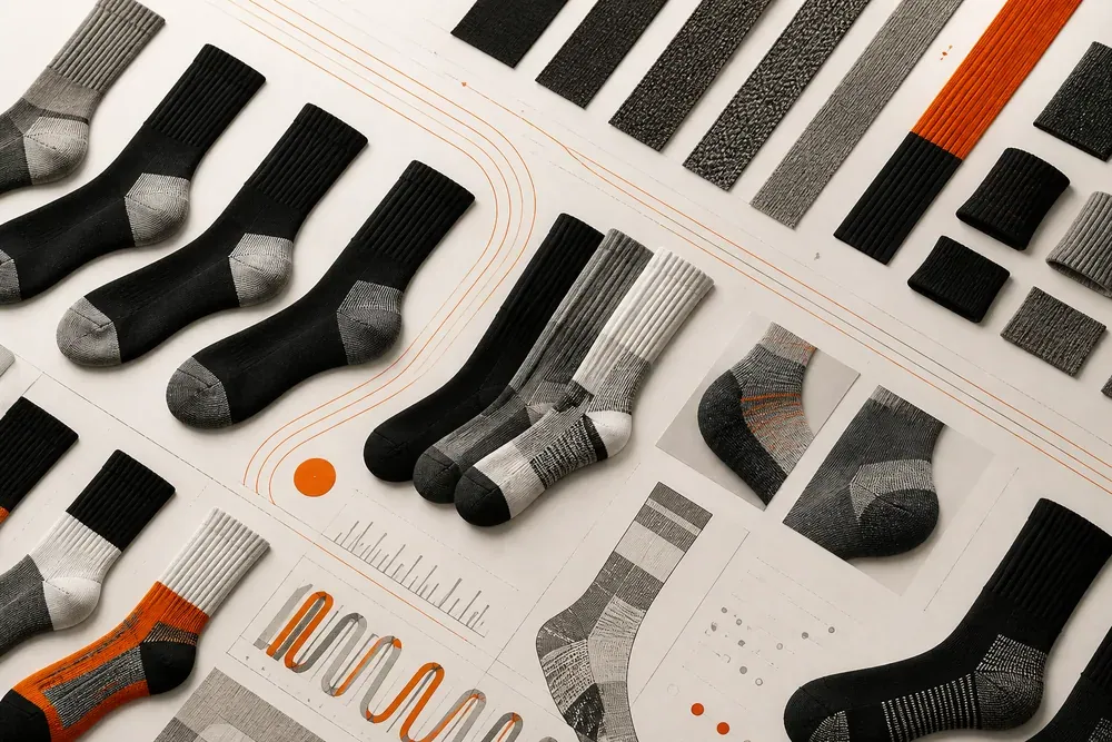
Ribbing, compression zones, and knit strips create a rhythm that can guide both product details and brand layouts.

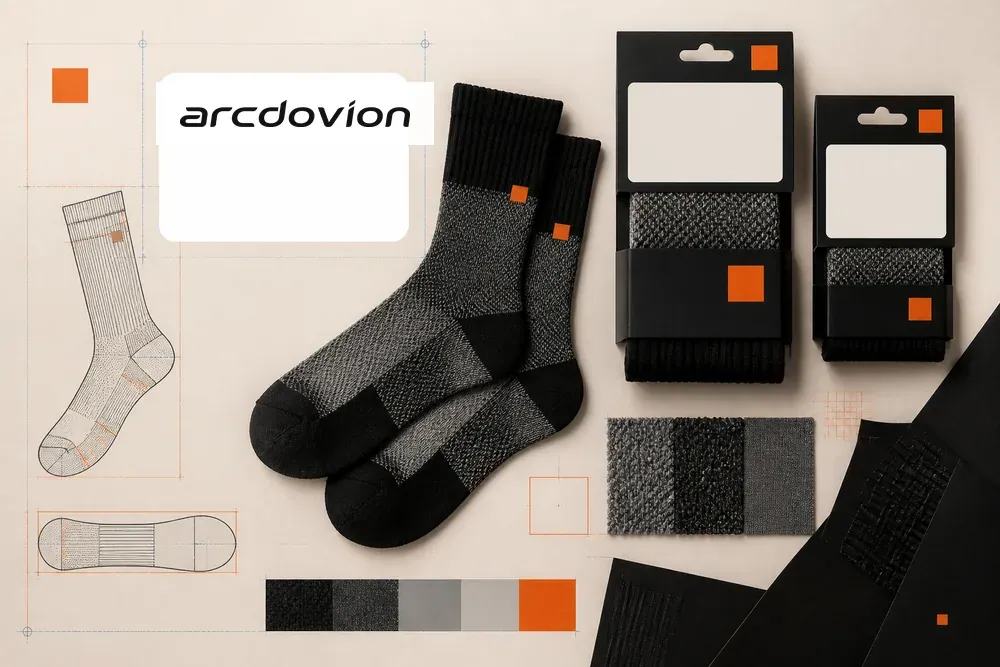
The wordmark, AD mark, labels, swatches, and sock construction sit in one system so the brand feels consistent at every touchpoint.

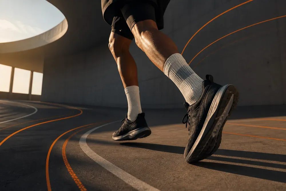
Visible crew socks, cushioned texture, architectural curves, and confident orange movement lines connect the product to active culture.
Product workflow
We begin with the real use case: commute, training, travel, gifting, studio, outdoor, or daily rotation.
Cuff, leg, arch, heel, toe, and sole are treated separately so each part has a clear design reason.
Category colors, logo placement, and packaging labels are designed after the product logic is clear.
The final check is simple: does the sock feel better, read clearer, and still look unmistakably ARCDOVION?
Next step
Explore the current collections or open a B2B inquiry with the same product and brand design logic.